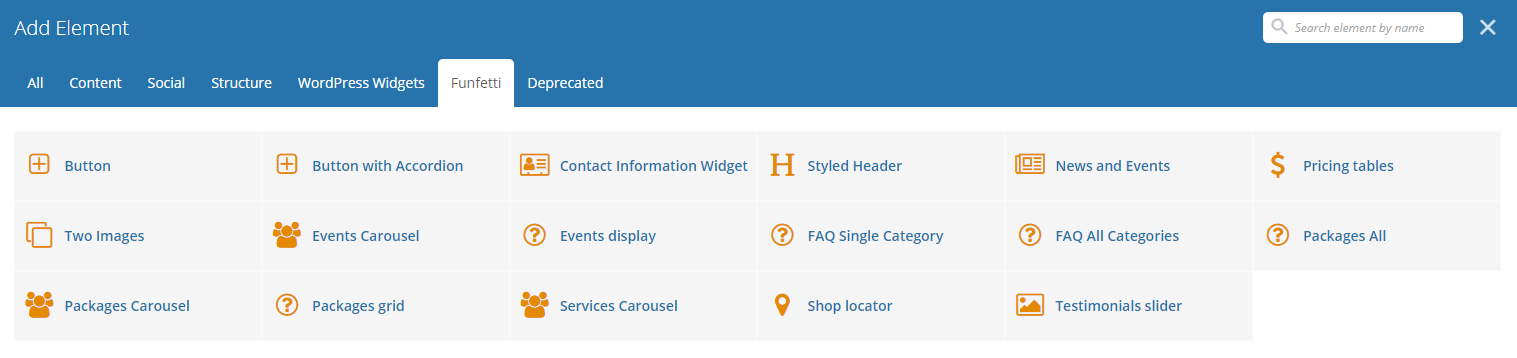
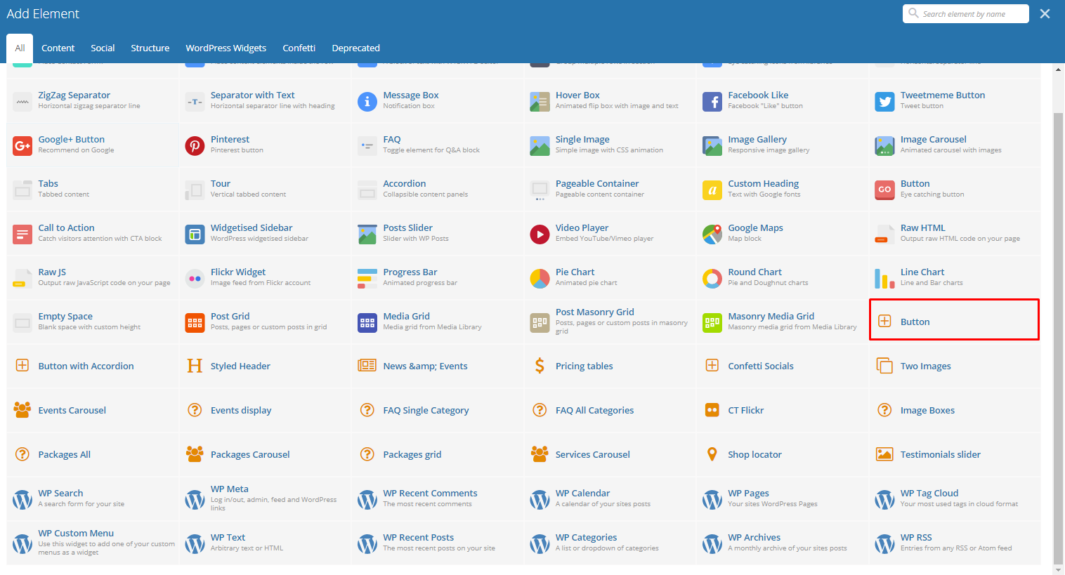
Funfetti Custom Shortcodes
With Funfetti comes many custom shortcodes for (Visual Composer) VC that are used to show content created in Funfetti.
Below you will find short information about this Visual Composer elements:
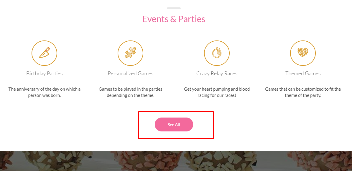
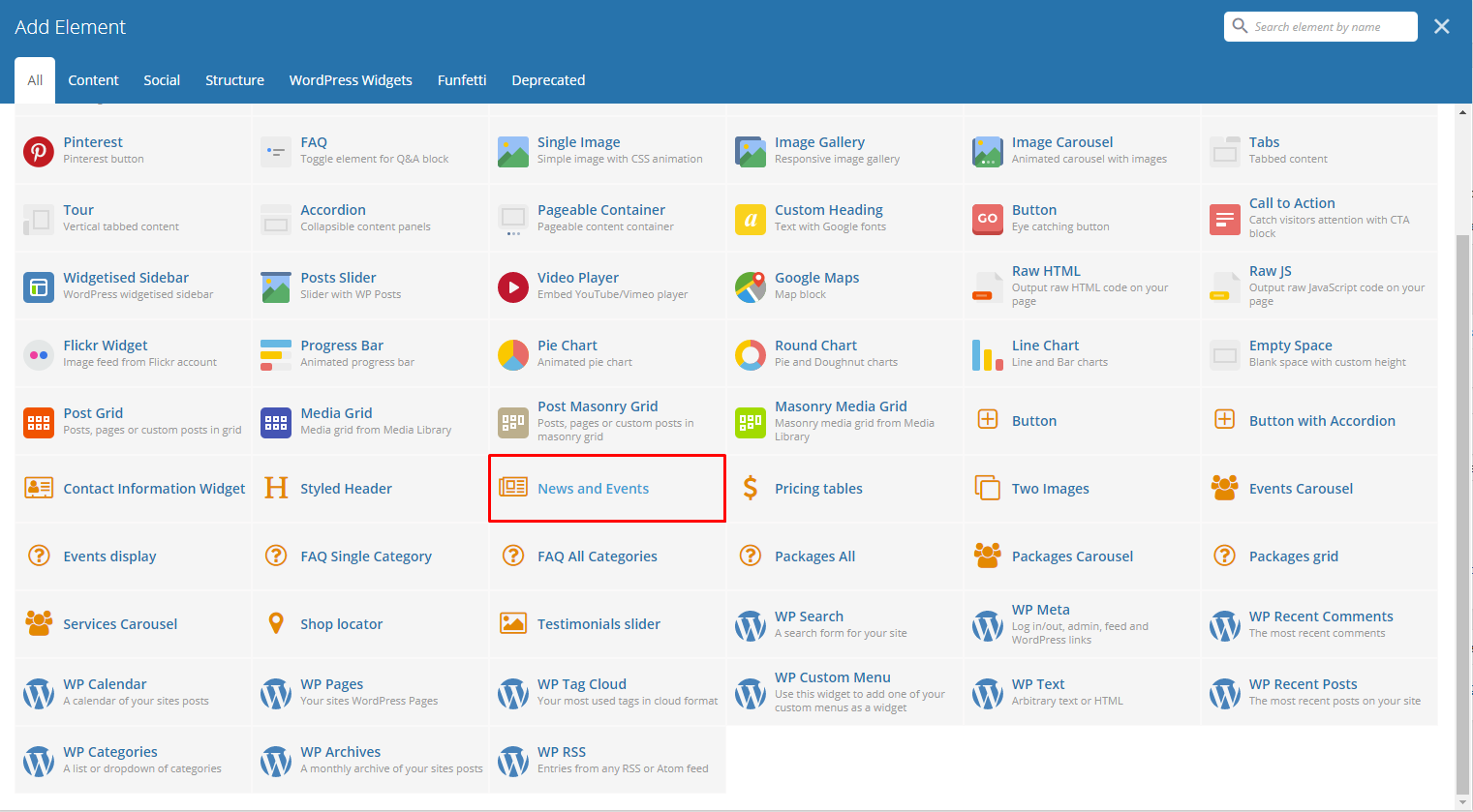
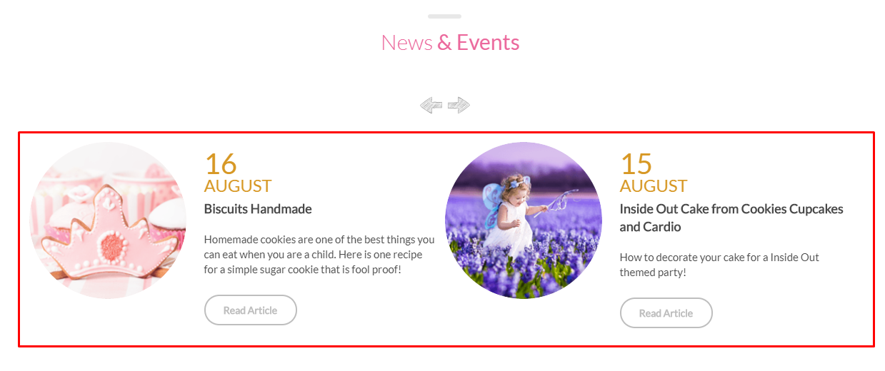
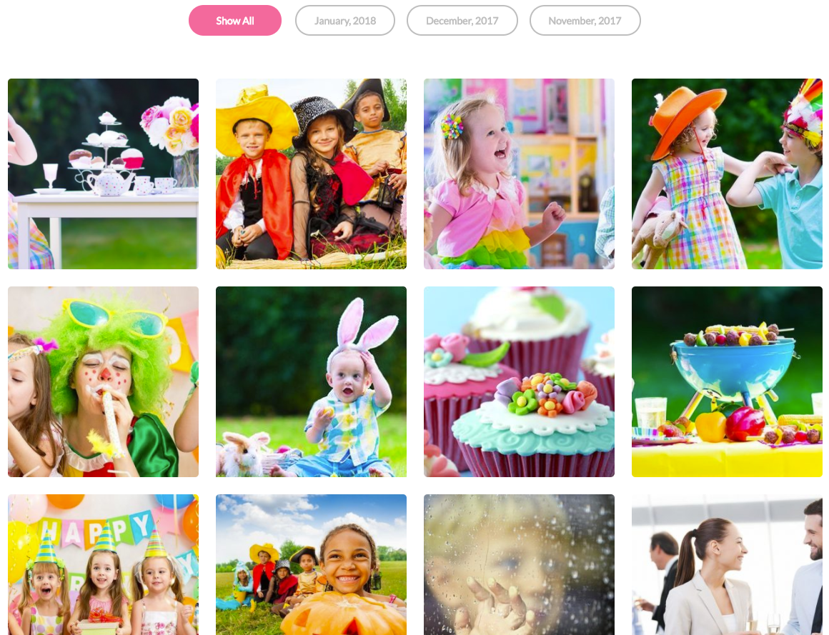
News and Events
This theme element will let you add a slider of the events items that are made. You can add filtering using the category of the event.
-Filters Tab-
- Limit - Set results limit.
- Skip X elements - Skip a number of elements from the results.
- Order - How the posts order looks.
- Order by - How the posts are ordered.
- Specify post - Only selected posts are shown.
- Exclude post - None of the selected posts will be displayed.
- Specify Category - Only show posts under the categories.
- Exclude Category - None of the posts under the categories are shown.
- Specify post tags - Only show posts with selected tags.
- Keyword search - Show items with certain keyword.
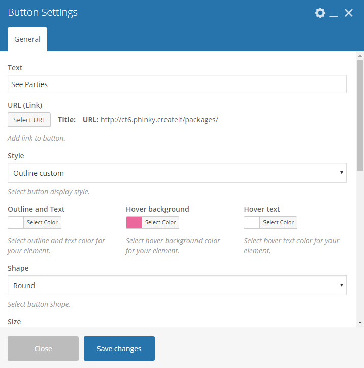
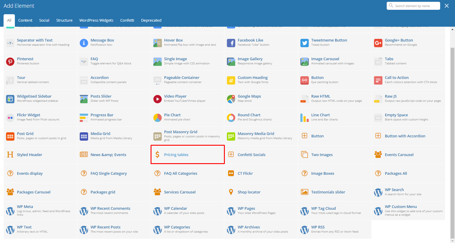
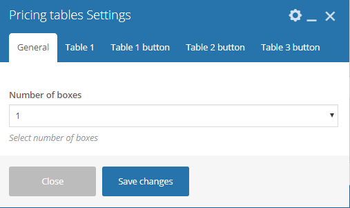
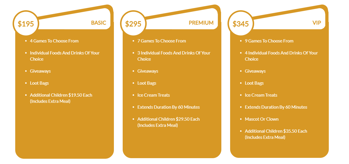
Pricing tables
This element lets you add a pricing table that you can customize.
-General Tab-
- Number of boxes - Set the number of pricing tables that will be shown in the row.
-Table Tab-
- Highlighted tab? - Options to show this table as an highlighted table.
- Title - Title of the table.
- Currency - Currency of the price inside the pricing table.
- Price - Price inside the table.
- Subtitle - Subtitle of the table.
- Features - Features to be shown inside the table. Each feature is separated by a comma.
- Include button - Option to add a button in the table.
-Button Tab-
- Text - The text label of the button.
- URL (Link) - URL link for the button.
- Style - Display style of the button.
- Shape - Shape of the button.
- Color - Color of the button.
- Size - Size of the button.
- Alignment - Alignment of the button.
- Add Icon? - Option to add an icon in the button.
- CSS Animation - If Add icon is Yes, this option will show. Add the icon you would like to use.
- Element ID - A unique ID for the button.
- Extra class name - You can add a Custom CSS variable that is made in the Customizer > Additional CSS, click here for details.
- Advance onclick action - Option to be add a javascript action.
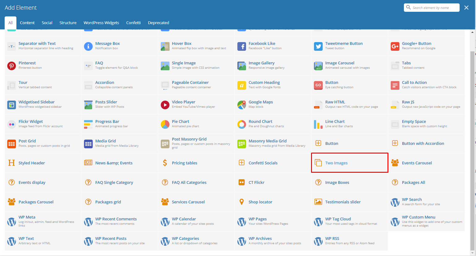
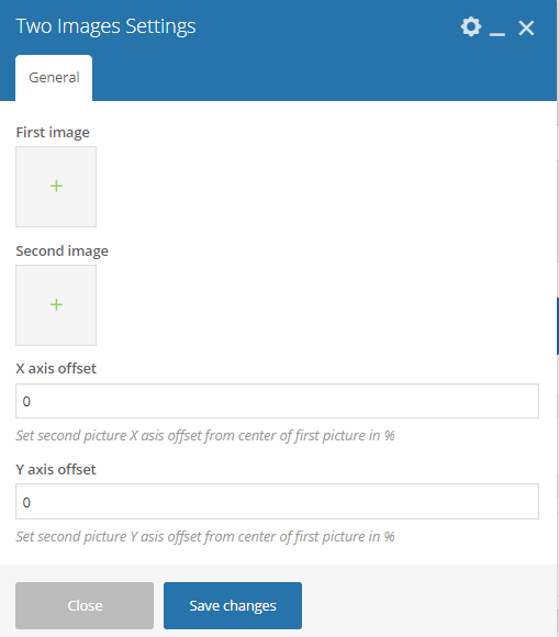
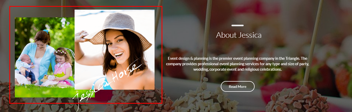
Two Images
Add two images in the same space with an option to move the second image using its X and Y axis.
-General Tab-
- First Image - Set the first image.
- Second Image - Set the second image.
- X axis offset - Horizontal offset of the second image from the first image.
- Y axis offset - Vertical offset of the second image from the first image.
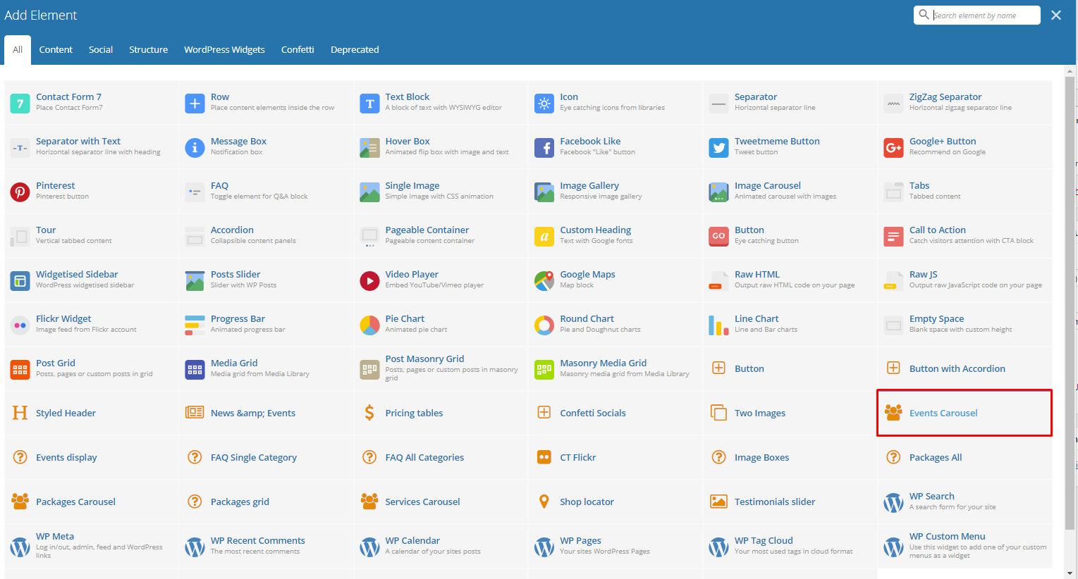
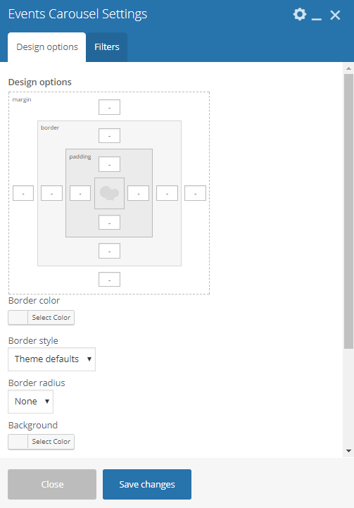
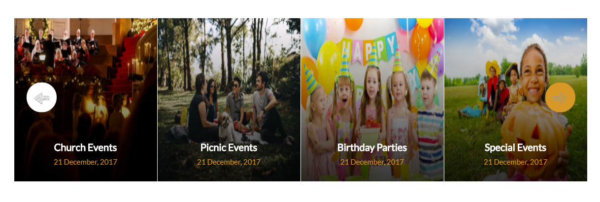
Events Carousel
Lets you display events as a carousel. You can filter the events that will show inside the carousel.
-Design options Tab-
- Design options - Add/Change the margin, border, or padding of the promo section.
- Border color - Color of the border line.
- Border style - The style of the border line.
- Border radius - The size of the border.
- Background - Background color or image of the promo section.
-Filters Tab-
- Limit - Set results limit.
- Skip X elements - Skip a number of elements from the results.
- Order - How the posts order looks.
- Order by - How the posts are ordered.
- Specify Events - Only selected posts are shown.
- Exclude Events - None of the selected posts will be displayed.
- Specify Category - Only show posts under the categories.
- Exclude Category - None of the posts under the categories are shown.
- Specify post tags - Only show posts with selected tags.
- Keyword search - Show items with certain keyword.
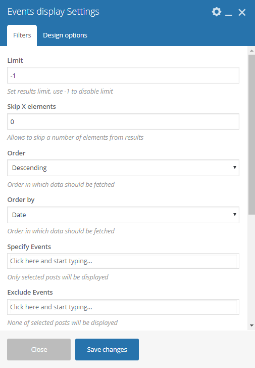
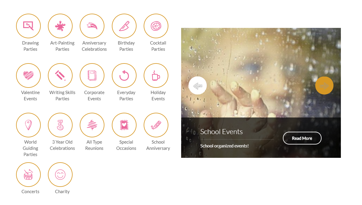
Events display
Lets you display events by category. You can filter the category that will show.
-Filters Tab-
- Limit - Set results limit.
- Skip X elements - Skip a number of elements from the results.
- Order - How the posts order looks.
- Order by - How the posts are ordered.
- Specify Events - Only selected posts are shown.
- Exclude Events - None of the selected posts will be displayed.
- Specify Category - Only show posts under the categories.
- Exclude Category - None of the posts under the categories are shown.
- Specify post tags - Only show posts with selected tags.
- Keyword search - Show items with certain keyword.
-Design options Tab-
- Design options - Add/Change the margin, border, or padding of the promo section.
- Border color - Color of the border line.
- Border style - The style of the border line.
- Border radius - The size of the border.
- Background - Background color or image of the promo section.
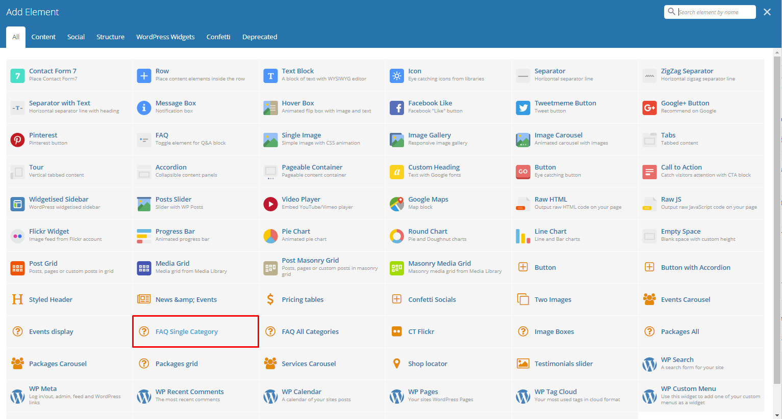
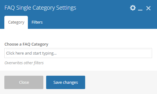
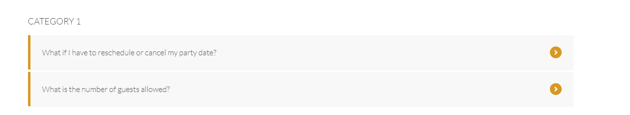
FAQ Single Category
This element lets you add an FAQs with a single category on the page.
-Category Tab-
- Choose a FAQ Category - Category of the FAQs that you want to show.
-Filters Tab-
- Limit - Set results limit.
- Skip X elements - Skip a number of elements from the results.
- Order - How the FAQs order looks.
- Order by - How the FAQs are ordered.
- Specify FAQ - Only selected FAQs are shown.
- Exclude FAQ - None of the selected FAQs will be displayed.
- Specify FAQ Categories - Only show FAQs under the categories.
- Exclude FAQ Categories - None of the FAQs under the categories are shown.
- Specify post tags - Only show posts with selected tags.
- Keyword search - Show events with certain keyword.
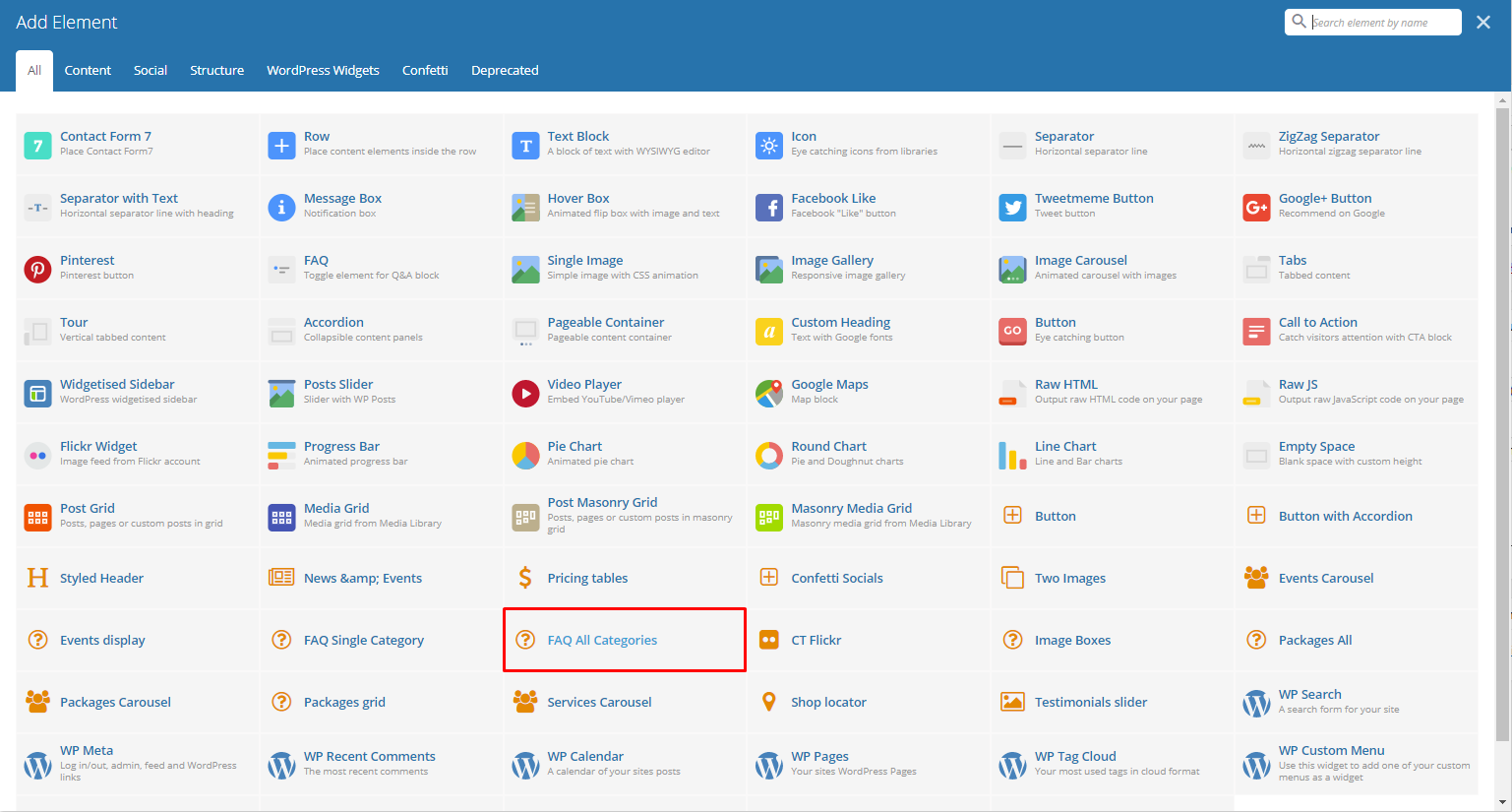
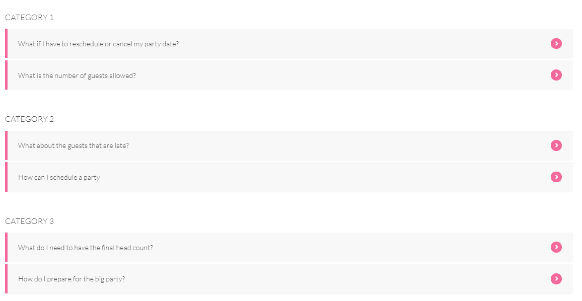
FAQ All Categories
This element lets you add all the FAQs on the page.
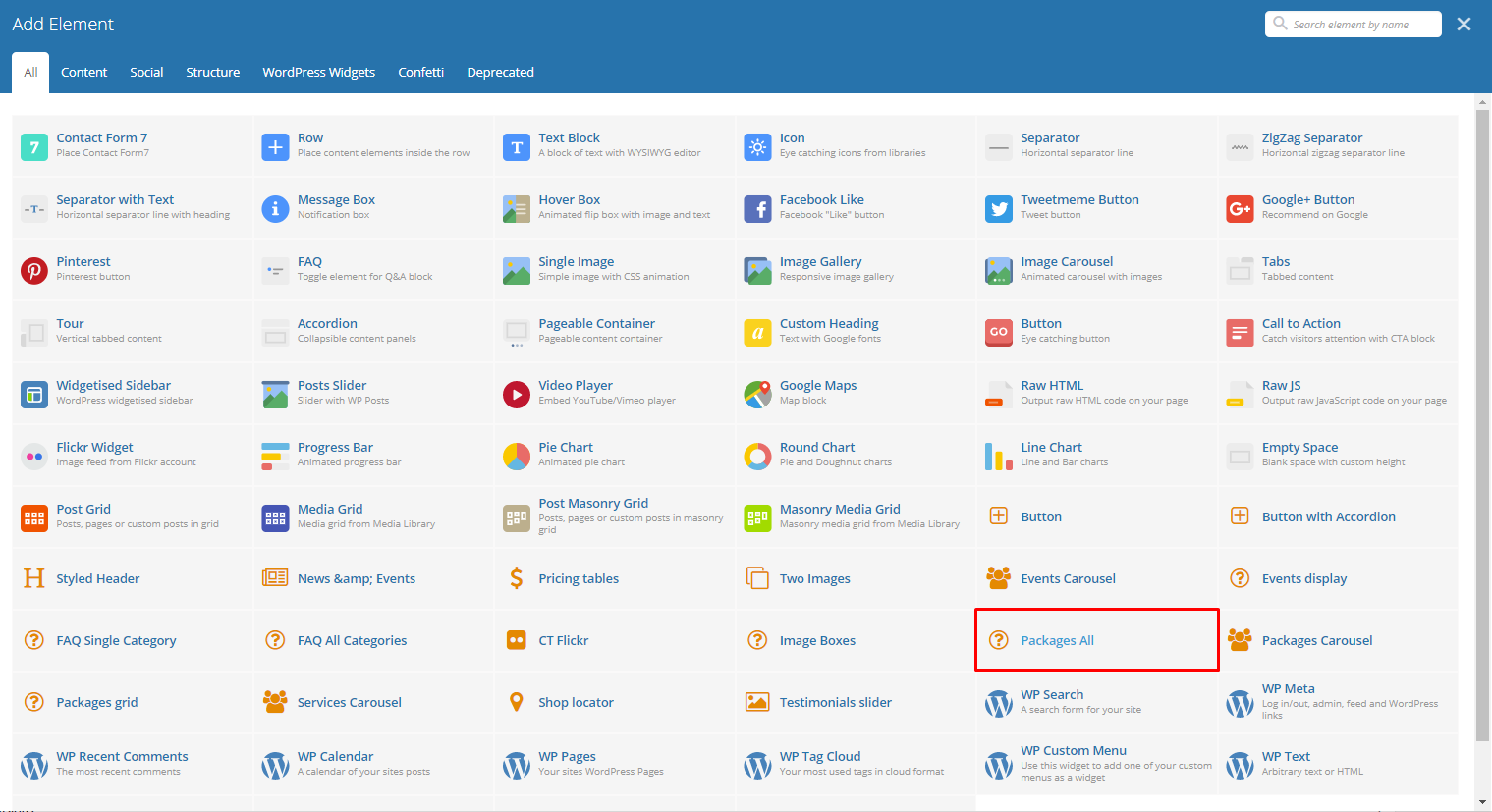
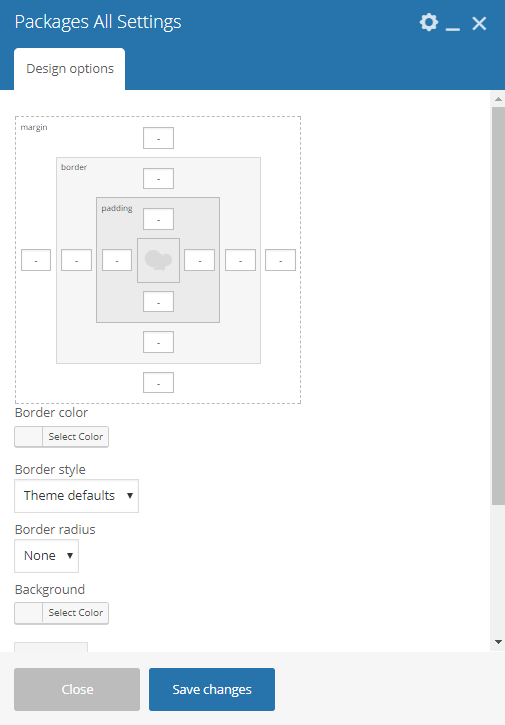
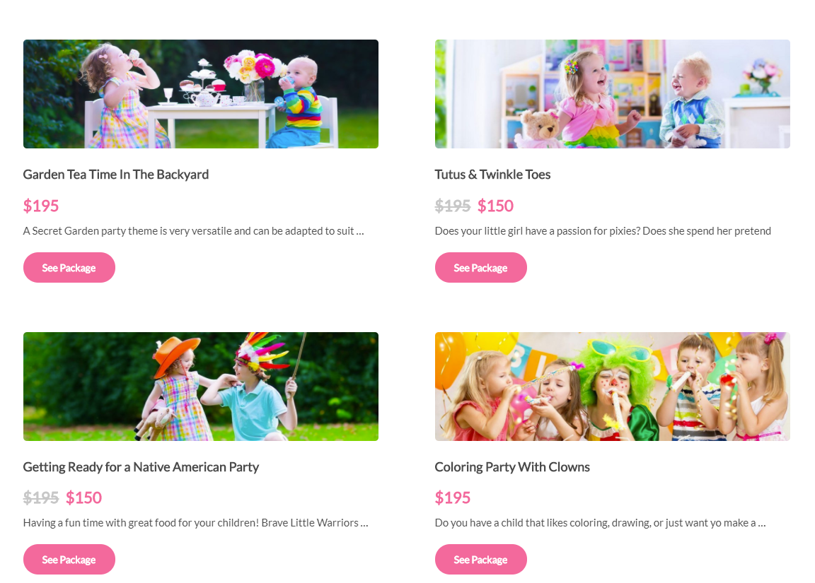
Packages All
This element lets you show all the available Packages.
-Design options Tab-
- Design options - Add/Change the margin, border, or padding of the promo section.
- Border color - Color of the border line.
- Border style - The style of the border line.
- Border radius - The size of the border.
- Background - Background color or image of the promo section.
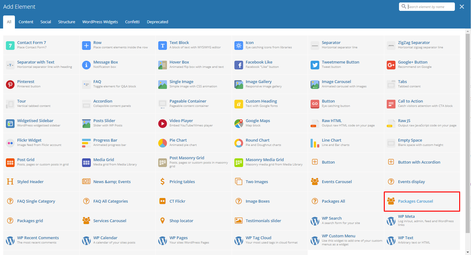
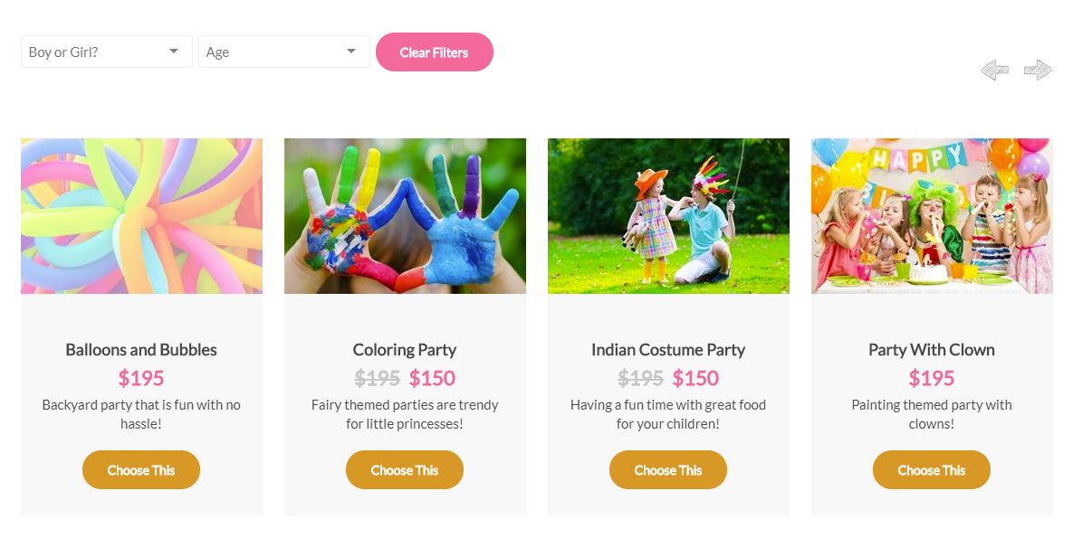
Packages Carousel
This element lets you show available Packages in a carousel.
-Filters Tab-
- Limit - Set results limit.
- Skip X elements - Skip a number of elements from the results.
- Order - How the team members order looks.
- Order by - How the team members are ordered.
- Specify Packages - Only selected team members are shown.
- Exclude Packages - None of the selected team members will be displayed.
- Specify Categories - Only show team members under the categories.
- Exclude Categories - None of the team members under the categories are shown.
- Specify post tags - Only show posts with selected tags.
- Keyword search - Show events with certain keyword.
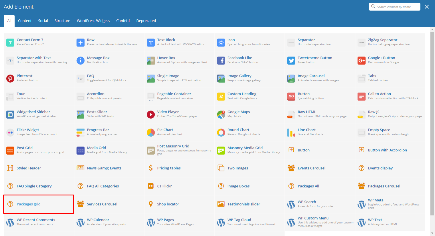
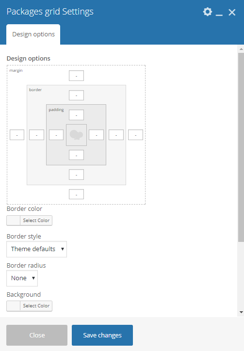
Packages grid
This element lets you show available Packages in a grid view.
-Design options Tab-
- Design options - Add/Change the margin, border, or padding of the promo section.
- Border color - Color of the border line.
- Border style - The style of the border line.
- Border radius - The size of the border.
- Background - Background color or image of the promo section.
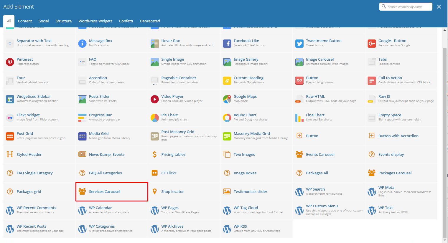
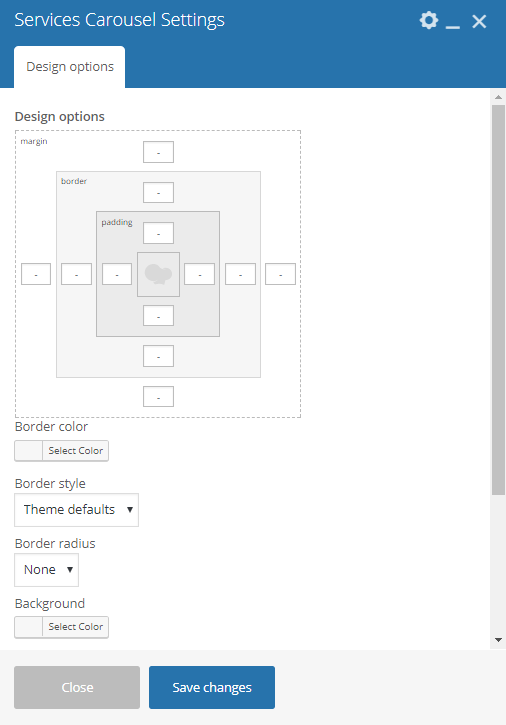
Services Carousel
Lets you show all the available Services in a carousel on the page.
-Design options Tab-
- Design options - Add/Change the margin, border, or padding of the promo section.
- Border color - Color of the border line.
- Border style - The style of the border line.
- Border radius - The size of the border.
- Background - Background color or image of the promo section.
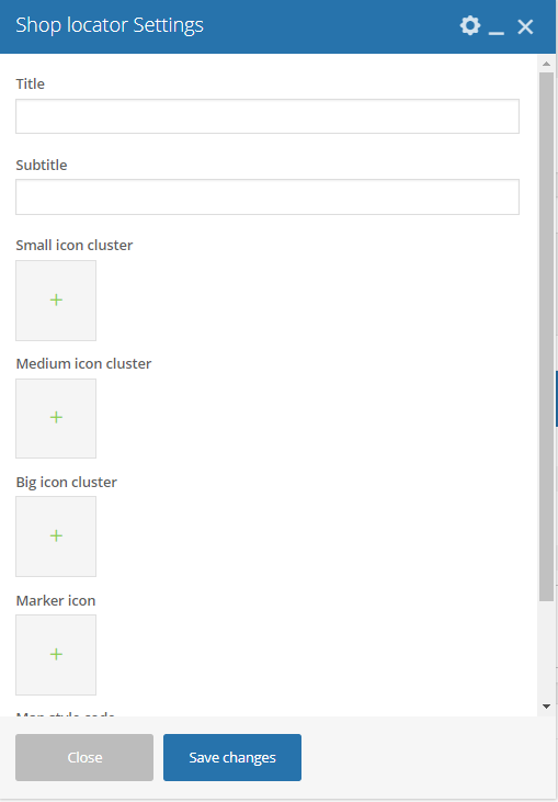
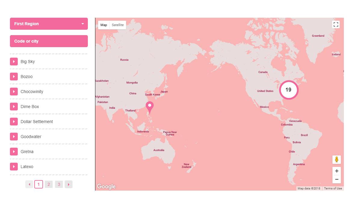
Shop locator
Lets you show all the available Services in a carousel on the page.
- Title - Title of the Shop locator.
- Subtitle - Subtitle of the Shop locator.
- Small icon cluster - Icon for a small number of store locations clustered in the same area.
- Medium icon cluster - Icon for few store locations clustered in the same area.
- Big icon cluster - Icon for many store locations clustered in the same area.
- Marker icon - Marker icon for the location of the store.
- Map style code - Paste “JavaScript Style Array” here, you can find and create it on: snazzymaps.com
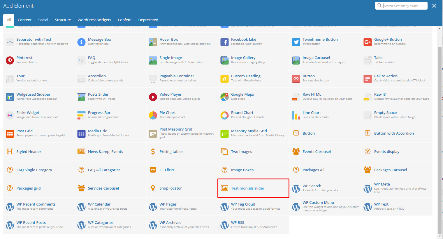
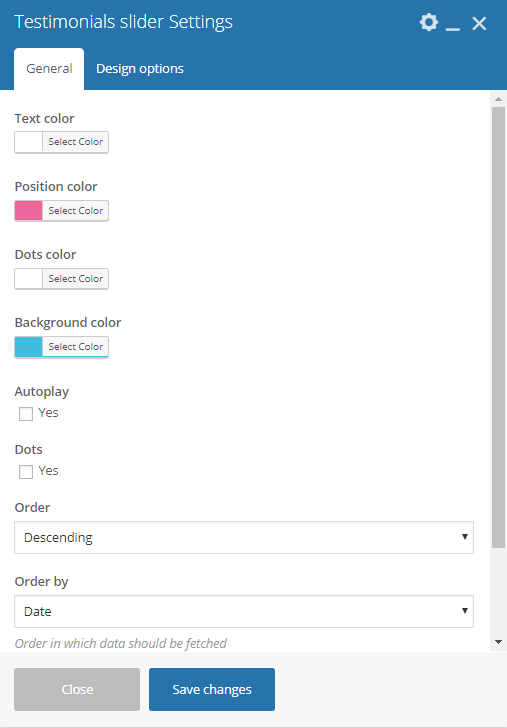
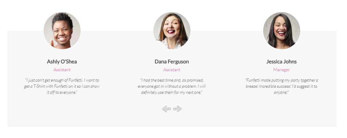
Testimonials slider
Gives you an option to show people dynamic Testimonial Items that are made on your site.
-General Tab-
- Text color - Font color of the testimonials.
- Position color - Font color for the position of the Testimonial’s Author.
- Dots color - Color for the dots that is shown when Dots option is checked.
- Background color - Background color of the slider.
- Autoplay - Make the slider automatically move.
- Fade - Option to make the testimonials fade rather than slide to change.
- Speed [ms] - Speed of the autoplay.
- Dots - Option to show navigation dots at the bottom of the testimonial slider.
- Order - How the testimonials order looks.
- Order by - How the testimonials are ordered.
- Limit - Limit on how many testimonials will show.
-Design options Tab-
- Design options - Add/Change the margin, border, or padding of the promo section.
- Border color - Color of the border line.
- Border style - The style of the border line.
- Border radius - The size of the border.
- Background - Background color or image of the promo section.